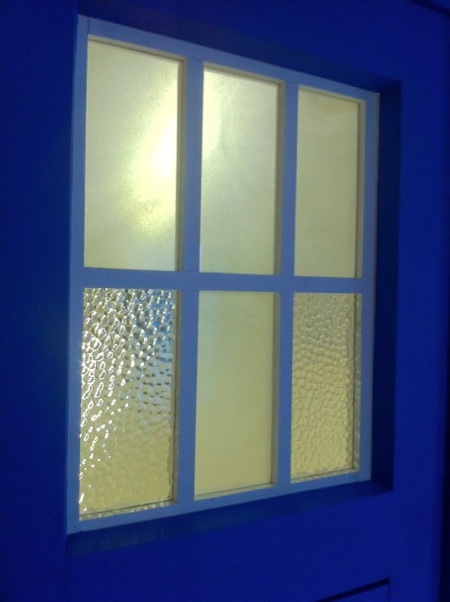
TARDIS Plans (revision 21)
NOW updated to version 21 with all new comments! Thank you so much for your replies! I have updated the plans and realized that the TARDIS now looks more like the Tom Yardley Jones one than the Newbery one, and changed the topic. The main changes were the top design and the header above the door, the height of the sign, and a few other minor tweaks.
I have kept the door height the same, and shaved off enough in height to easily fit into the space I like. For the convention, I have a lot more height I can work with, and will build a 3" tall extension for the lamp above, and may make apply a few other tweaks to temporarily raise the height another 2-3" for effect. I am not that worried about it though. If it looks sharp another few inches in height will not matter much Wink
I notice the Yale lock is on the left door panel in many of the pics, but on the owner plans the lock is above the handle on the door, and in my representation it is underneath. Any comments on this? What is more standard, and what is tradition for the TARDIS?
I kept the ceiling grade the same, because when inside my home I want it to illuminate the room, and I think an extra 1/2" in grade will make a huge difference. I would squeeze out another 1/2" in roof grade if I could. I am also considering cutting slits along the base and top of the POLICE BOX sign so that there is some down and up lighting across the face of the TARDIS when it is turned on. This could have a huge effect!
As for the sign, I do not know which kind. I did find the Brachaki sign lettering on this site. Is there a better suggestion?
Thanks again, and I look forward to your comments!
-- Christian
I appreciate your comments and look forward to your advice


Comments
Post a Comment